Dev Diary: You can never have too much change
Even this late into development (and we are late into development!) we’re still making changes to the basic layout of DestinyQuest Infinite. If you’re a newsletter subscriber you’ve probably seen how much the look has changed from the beginning. Here’s a comparison of the earliest version of combat. From this:
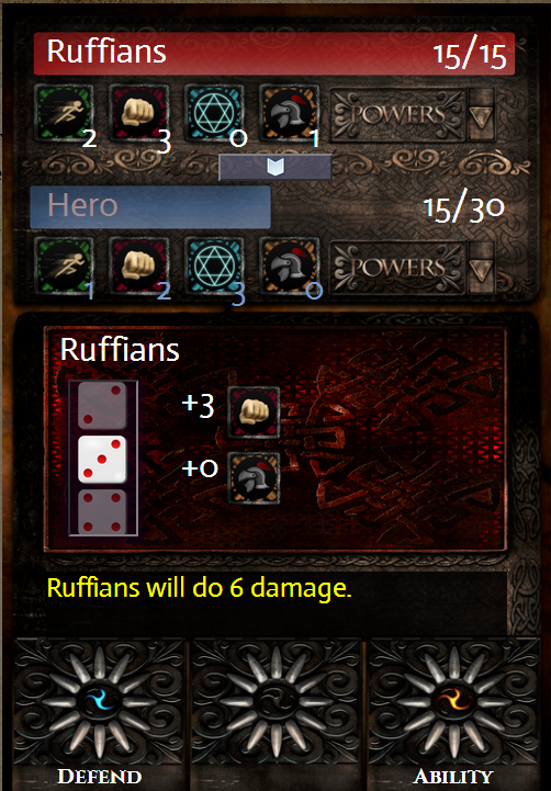
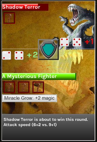 To this:
But feedback from some very early testers, as well DestinyQuest’s own author Michael J Ward has turned our attention to user experience once again. We’ve decided to pause the bug hunting and focus on some basic – and some major – design changes.
One of the biggest changes we’re making is smoothing over the page flipping process. This means we’ll either create one long scroll-able parchment, or get rid of the scrollbar entirely. If we do that, we’ll need to find a new different way to split up the text into pages, and also make sure no rogue words are left alone on a page.
We’re also looking at making combat more intuitive. Stat icons will now be clickable, monster info will expand into monster cards will full explanations of their powers, and abilities will display a description during battle.
At the moment the proposed changes look like this:
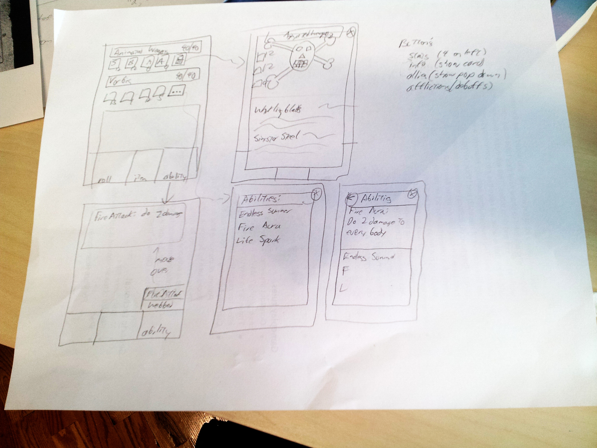
Fancy, isn’t it? We’ll share more when there’s more to look at!
August 29, 2014 Friday at 11:30 am