
Dev Diary: Changes we’ve made in the UI
DestinyQuest Infinite has been evolving constantly since we started making it. If you’re a newsletter subscriber, you’ve seen it in our “evolution of combat” email.
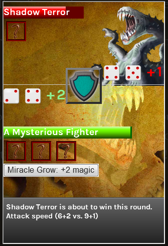 It has its charms, but I have to admit the new one is a vast improvement.
Combat isn’t the only thing that’s been evolving. Even right before launch we were tweaking the interface.
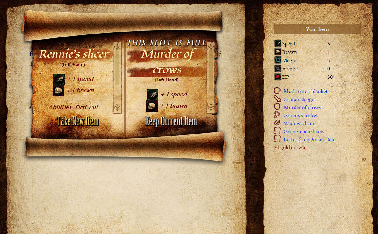 Version 0.1: Our old interface. Scrolls everywhere!
Along with the big change – new item cards, you may notice another change, this one on the sidebar: Speed is on its own line.
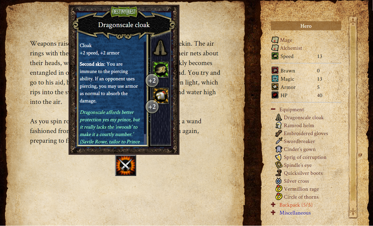 Version 1.0
We got a lot of comments from you all mentioning how important speed is compared to the other attributes, and we made a deliberate decision about how to address the issue. Short of changing Speed’s name to “Level” – “Rolling for level” doesn’t make a lot of sense – we were trying to make Speed stand out on its own, to signify its importance.
Since early access, we’ve also made some changes to the combat window. Yep, combat is still changing.
We thought the combat window was fine until we started testing with actual people who hadn’t been staring at this game for four years. What we discovered is that some parts were unnecessary, while others simply made no sense unless you were fighting a very specific fight.
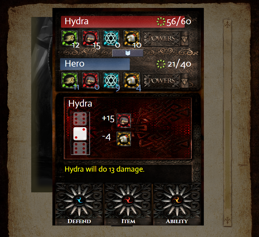 The old version – yes, still tweaking.
You can see some of the subtle changes we made below:
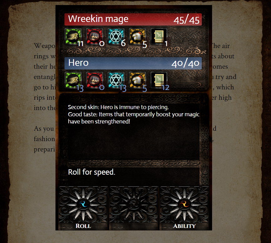
Most significant is the new fifth button. Clicking on that button gives you something new – monster and player cards. Now you can see all your skills, items, and their descriptions in an order that makes sense!
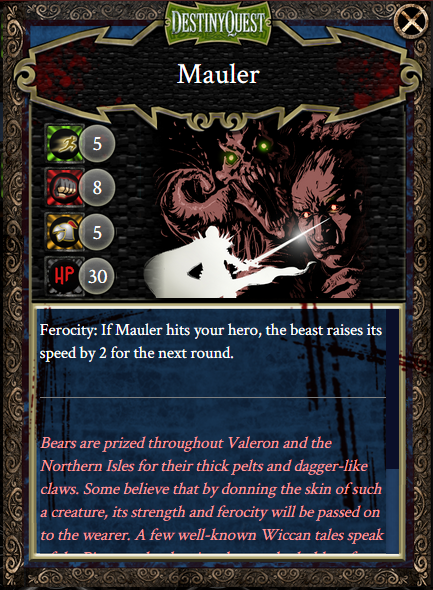 The monster cards, aside from looking awesome, make it easy to see what you’re up against at a glance.
DestinyQuest Infinite: Act 1 is officially launched, but the great thing about starting with a web version is that we can continuously work on perfecting the UI as we get more feedback (and feedback is always welcome!).
February 20, 2015 Friday at 1:05 pm


